Creating a Flutter based responsive login screen
Cross-platform mobile application development framework Flutter allows you to create apps that look and feel great on every platform using a single codebase. With Flutter 3.0 release, we now have a fully stable Windows, macOS, and web platform.
This implies that when creating an app for these platforms, we must consider various device requirements and ensure our product’s appeal is consistent and gives users a pleasant experience. With this in mind, Flutter offers many widgets and classes for building responsive layouts in apps, including MediaQuery, Expanded, LayoutBuilder, AspectRatio, and Flexible.
The login screen is one of the most important aspects of any mobile app. It’s the first thing users see when they open your app and needs to make a good impression. In this article, we’ll look at how to create a responsive login page using the two main approaches advised by the Flutter team: MediaQuery and LayoutBuilder classes.
To continue, I recommend that you check to make sure that you meet the following prerequisites before moving on:
- Any IDE with access to the Flutter SDK installed (i.e., Android Studio, VSCode)
- The latest version of Visual Studio, XCode, is required for Windows desktop app development
- You’ll need to have Chrome installed for web development
- You should be familiar with Dart and Flutter
So, with everything in mind, let’s get started.
The MediaQuery class
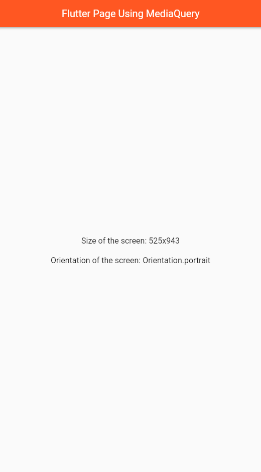
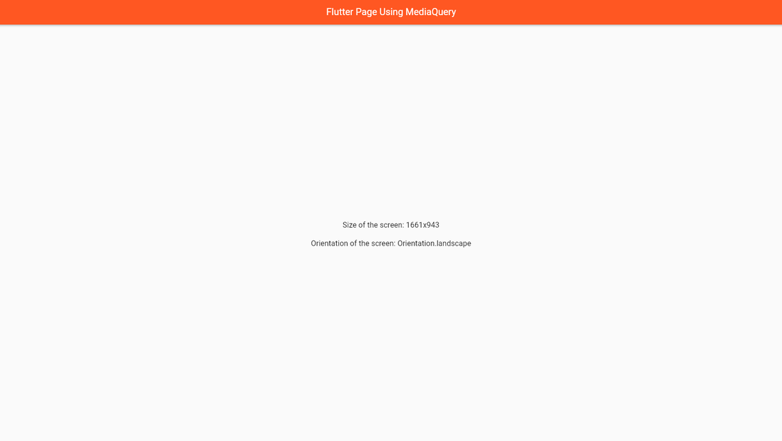
The MediaQuery class provides a .of method that accepts a context and returns the current app’s width, height size, and portrait and landscape orientations.
This is useful when we want our login page to look good on small and large screens.
For example, consider the following scenario:
Using MediaQuery class
//...class _MyHomePageState extends State<MyHomePage> {@overrideWidget build(BuildContext context) {//get size propertyfinal size = MediaQuery.of(context).size;//get orientationfinal orientation = MediaQuery.of(context).orientation;return Scaffold(appBar: AppBar(title: const Center(child: Text("Flutter Page Using MediaQuery")),),body: Center(child: Column(mainAxisAlignment: MainAxisAlignment.center,children: <Widget>[Text('Size of the screen: ${size.width}x${size.height}',style: const TextStyle(fontSize: 16)),const SizedBox(height: 20),Text('Orientation of the screen: $orientation',style: const TextStyle(fontSize: 16)),],),),);}}
Output:
In Mobile screen
In Web/Desktop screen
The LayoutBuilder class
A builder property on the LayoutBuilder class allows us to access a BoxConstraint object.
This object contains constraint data for a specific widget, which can be utilized to compute the widget’s maximum width and height. These values are critical in calculating our display dimensions according to the sizing limitations established for our widgets.
For example, here’s one:
Using LayoutBuilder widget
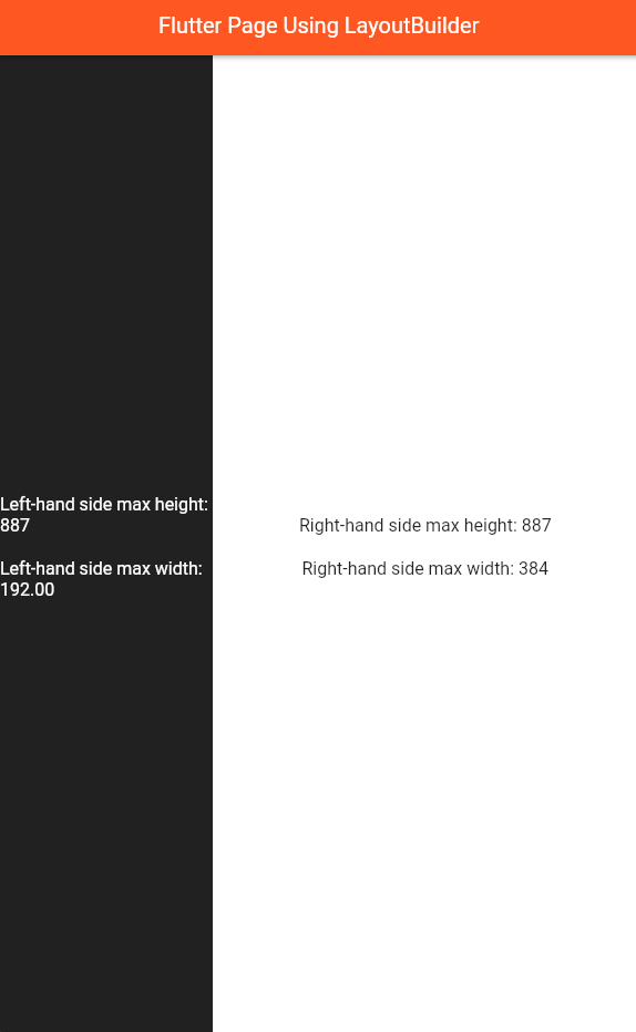
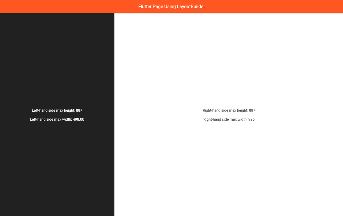
//...class _MyHomePageState extends State<MyHomePage> {@overrideWidget build(BuildContext context) {return Scaffold(appBar: AppBar(title: Center(child: Text("Using LayoutBuilder")),),body: Row(children: [Expanded(flex: 2,child: LayoutBuilder(builder: (context, constraints) {return Container(width: constraints.maxWidth,height: constraints.maxHeight,color: Colors.grey.shade900,child: Column(mainAxisAlignment: MainAxisAlignment.center,children: <Widget>[Center(child: Text('Left-hand side max height: ${constraints.maxHeight}',style:const TextStyle(fontSize: 16, color: Colors.white),),),const SizedBox(height: 20),Center(child: Text('Left-hand side max width: ${constraints.maxWidth.toStringAsFixed(2)}',style:const TextStyle(fontSize: 16, color: Colors.white),),),],),);}),),Expanded(flex: 4,child: LayoutBuilder(builder: (context, constraints) {return Container(width: constraints.maxWidth,height: constraints.maxHeight,color: Colors.white,child: Column(mainAxisAlignment: MainAxisAlignment.center,children: <Widget>[Text('Right-hand side max height: ${constraints.maxHeight}',style: const TextStyle(fontSize: 16),),const SizedBox(height: 20),Text('Right-hand side max width: ${constraints.maxWidth}',style: const TextStyle(fontSize: 16)),],),);}),),],),);}}
Output:
In Mobile screen
In Web/Desktop screen
Now that we know how they operate Let’s use them to create a responsive login page that works on all devices.
Project Setup
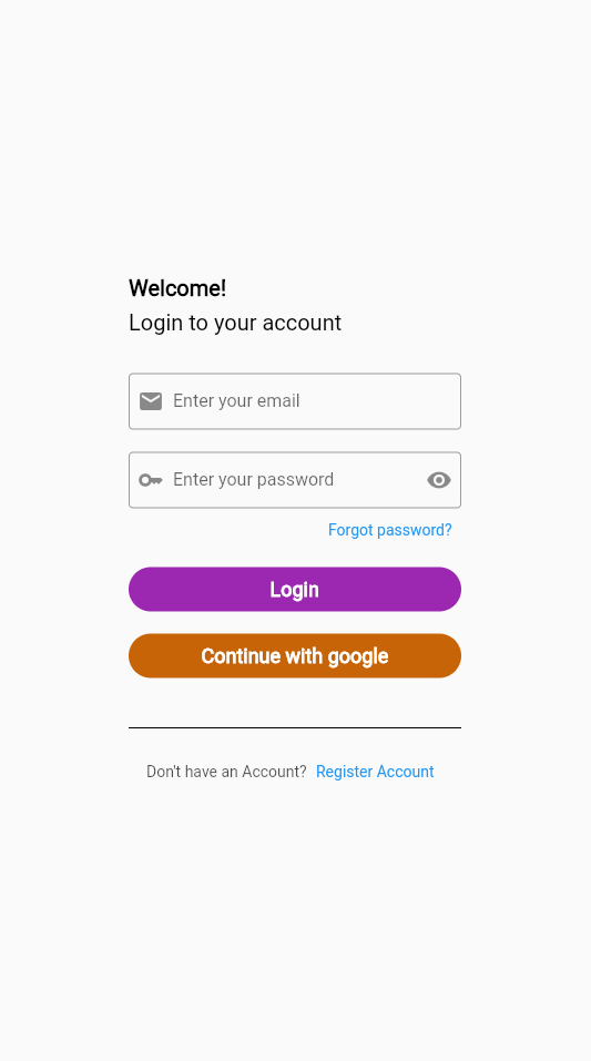
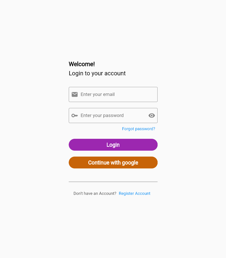
To begin, we’ll create a basic login screen similar to the ones shown below:
Mobile view
Tablet view
Web/Desktop View
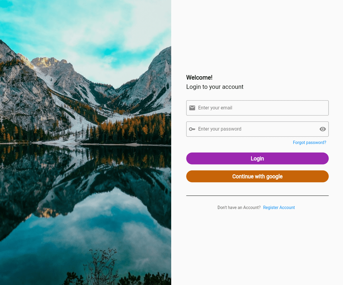
Now, let’s launch a new Flutter project and copy the following content into your main.dart file as the application’s starting point:
lib > main.dart
import 'package:flutter/material.dart';import 'LoginScreen.dart';void main() {runApp(const MyApp());}class MyApp extends StatelessWidget {const MyApp({Key? key}) : super(key: key);// This widget is the root of your application.@overrideWidget build(BuildContext context) {return MaterialApp(title: 'Flutter Login Page',debugShowCheckedModeBanner: false,theme: ThemeData(primarySwatch: Colors.blue,),home: const LoginScreen(),);}}
Let’s now create the LoginScreen widget. This widget can contain our LayoutBuilder class and how we may return various screens depending on the device size requirements.
Now, create a LoginScreen.dart file in a lib folder.
lib > LoginScreen.dart
import 'package:flutter/material.dart';import 'LoginDesktop.dart';import 'LoginMobile.dart';import 'LoginTablet.dart';class LoginScreen extends StatelessWidget {const LoginScreen({Key? key}) : super(key: key);@overrideWidget build(BuildContext context) {return Scaffold(body: LayoutBuilder(builder: (context, constraints) {if (constraints.maxWidth < 600) {return const LoginMobile();} else if (constraints.maxWidth > 600 && constraints.maxWidth < 900) {return const LoginTablet();} else {return const LoginDesktop();}},),);}}
Take note of the code sample above, which contains a width breakpoint, and then tests to see whether the device maxWidth value is larger or smaller than the width breakpoint using the constraint object generated by the LayoutBuilder widget.
Here in our project, If the maximum width is less than 600, we return the mobile view; if it’s between 600 and 900, we return the tablet view; otherwise, we return the desktop/web view.
Mobile view
The LoginMobile widget contains two TextFormField widgets, each of which serves as an email field and a password field, as well as a button to process event registration, as shown in the code below.
Now, create a LoginMobile.dart file in a lib folder.
lib > LoginMobile.dart
import 'package:flutter/material.dart';class LoginMobile extends StatefulWidget {const LoginMobile({Key? key}) : super(key: key);@overrideState<LoginMobile> createState() => _LoginMobileState();}class _LoginMobileState extends State<LoginMobile> {@overrideWidget build(BuildContext context) {return Center(child: SingleChildScrollView(child: Padding(padding: const EdgeInsets.all(30),child: Center(child: SizedBox(width: 300,child: SingleChildScrollView(child: Column(mainAxisAlignment: MainAxisAlignment.center,crossAxisAlignment: CrossAxisAlignment.stretch,children: [const Text('Welcome!',style: TextStyle(fontSize: 20,color: Colors.black,fontWeight: FontWeight.bold),),const SizedBox(height: 8),const Text('Login to your account',style: TextStyle(fontSize: 20, color: Colors.black),),const SizedBox(height: 35),TextFormField(keyboardType: TextInputType.emailAddress,decoration: const InputDecoration(labelText: 'Enter your email',border: OutlineInputBorder(),prefixIcon: Icon(Icons.email),),),const SizedBox(height: 20),TextFormField(keyboardType: TextInputType.visiblePassword,obscureText: true,decoration: const InputDecoration(labelText: 'Enter your password',border: OutlineInputBorder(),prefixIcon: Icon(Icons.key),suffixIcon: Icon(Icons.remove_red_eye),),),const SizedBox(height: 5),Row(mainAxisAlignment: MainAxisAlignment.end,children: [TextButton(onPressed: () {},child: const Text('Forgot password?'))],),const SizedBox(height: 20),Container(height: 40,width: double.infinity,decoration: BoxDecoration(borderRadius: BorderRadius.circular(100),color: Colors.purple),child: MaterialButton(onPressed: () {},child: const Text('Login',style: TextStyle(fontSize: 18,fontWeight: FontWeight.bold,color: Colors.white,),),),),const SizedBox(height: 20),Container(height: 40,width: double.infinity,decoration: BoxDecoration(borderRadius: BorderRadius.circular(100),color: Color.fromARGB(255, 199, 100, 8)),child: MaterialButton(onPressed: () {},child: const Text('Continue with google',style: TextStyle(fontSize: 18,fontWeight: FontWeight.bold,color: Colors.white,),),),),const SizedBox(height: 30),const Divider(height: 30,color: Colors.black,),const SizedBox(height: 10),Row(mainAxisAlignment: MainAxisAlignment.center,children: [Text("Don't have an Account?",style:TextStyle(color: Colors.black.withOpacity(0.7)),),TextButton(onPressed: () {},child: const Text('Register Account'))],),],),),),),),),);}}
Output:

Tablet view
The tablet view code remains the same since the mobile and tablet views provide the same result.
So, now create a LoginTablet.dart file in a lib folder.
lib > LoginTablet.dart
import 'package:flutter/material.dart';class LoginTablet extends StatefulWidget {const LoginTablet({Key? key}) : super(key: key);@overrideState<LoginTablet> createState() => _LoginTabletState();}class _LoginTabletState extends State<LoginTablet> {@overrideWidget build(BuildContext context) {return Center(child: SingleChildScrollView(child: Padding(padding: const EdgeInsets.all(30),child: Center(child: SizedBox(width: 300,child: SingleChildScrollView(child: Column(mainAxisAlignment: MainAxisAlignment.center,crossAxisAlignment: CrossAxisAlignment.stretch,children: [const Text('Welcome!',style: TextStyle(fontSize: 20,color: Colors.black,fontWeight: FontWeight.bold),),const SizedBox(height: 8),const Text('Login to your account',style: TextStyle(fontSize: 20, color: Colors.black),),const SizedBox(height: 35),TextFormField(keyboardType: TextInputType.emailAddress,decoration: const InputDecoration(labelText: 'Enter your email',border: OutlineInputBorder(),prefixIcon: Icon(Icons.email),),),const SizedBox(height: 20),TextFormField(keyboardType: TextInputType.visiblePassword,obscureText: true,decoration: const InputDecoration(labelText: 'Enter your password',border: OutlineInputBorder(),prefixIcon: Icon(Icons.key),suffixIcon: Icon(Icons.remove_red_eye),),),const SizedBox(height: 5),Row(mainAxisAlignment: MainAxisAlignment.end,children: [TextButton(onPressed: () {},child: const Text('Forgot password?'))],),const SizedBox(height: 20),Container(height: 40,width: double.infinity,decoration: BoxDecoration(borderRadius: BorderRadius.circular(100),color: Colors.purple),child: MaterialButton(onPressed: () {},child: const Text('Login',style: TextStyle(fontSize: 18,fontWeight: FontWeight.bold,color: Colors.white,),),),),const SizedBox(height: 20),Container(height: 40,width: double.infinity,decoration: BoxDecoration(borderRadius: BorderRadius.circular(100),color: Color.fromARGB(255, 199, 100, 8)),child: MaterialButton(onPressed: () {},child: const Text('Continue with google',style: TextStyle(fontSize: 18,fontWeight: FontWeight.bold,color: Colors.white,),),),),const SizedBox(height: 30),const Divider(height: 30,color: Colors.black,),const SizedBox(height: 10),Row(mainAxisAlignment: MainAxisAlignment.center,children: [Text("Don't have an Account?",style:TextStyle(color: Colors.black.withOpacity(0.7)),),TextButton(onPressed: () {},child: const Text('Register Account'))],),],),),),),),),);}}
Output:

Web/desktop view
For the web/desktop view, we’ll display a split screen with an image and our login components. We combine them side by side in a Row widget, then wrap both sides with an Expanded widget to fill up the remaining free space.
now, create a LoginDesktop.dart file in a lib folder.
lib > LoginDesktop.dart
import 'package:flutter/material.dart';class LoginDesktop extends StatefulWidget {const LoginDesktop({Key? key}) : super(key: key);@overrideState<LoginDesktop> createState() => _LoginDesktopState();}class _LoginDesktopState extends State<LoginDesktop> {@overrideWidget build(BuildContext context) {return Row(children: [Expanded(//<-- Expanded widgetchild: Image.asset('lib/icons/mountain.jpg',fit: BoxFit.cover,),),Expanded(//<-- Expanded widgetchild: Container(constraints: const BoxConstraints(maxWidth: 21),padding: const EdgeInsets.symmetric(horizontal: 50),child: Column(mainAxisAlignment: MainAxisAlignment.center,crossAxisAlignment: CrossAxisAlignment.stretch,children: [const Text('Welcome!',style: TextStyle(fontSize: 20,color: Colors.black,fontWeight: FontWeight.bold),),const SizedBox(height: 8),const Text('Login to your account',style: TextStyle(fontSize: 20, color: Colors.black),),const SizedBox(height: 35),TextFormField(keyboardType: TextInputType.emailAddress,decoration: const InputDecoration(labelText: 'Enter your email',border: OutlineInputBorder(),prefixIcon: Icon(Icons.email),),),const SizedBox(height: 20),TextFormField(keyboardType: TextInputType.visiblePassword,obscureText: true,decoration: const InputDecoration(labelText: 'Enter your password',border: OutlineInputBorder(),prefixIcon: Icon(Icons.key),suffixIcon: Icon(Icons.remove_red_eye),),),const SizedBox(height: 5),Row(mainAxisAlignment: MainAxisAlignment.end,children: [TextButton(onPressed: () {}, child: const Text('Forgot password?'))],),const SizedBox(height: 20),Container(height: 40,width: double.infinity,decoration: BoxDecoration(borderRadius: BorderRadius.circular(100),color: Colors.purple),child: MaterialButton(onPressed: () {},child: const Text('Login',style: TextStyle(fontSize: 18,fontWeight: FontWeight.bold,color: Colors.white,),),),),const SizedBox(height: 20),Container(height: 40,width: double.infinity,decoration: BoxDecoration(borderRadius: BorderRadius.circular(100),color: Color.fromARGB(255, 199, 100, 8)),child: MaterialButton(onPressed: () {},child: const Text('Continue with google',style: TextStyle(fontSize: 18,fontWeight: FontWeight.bold,color: Colors.white,),),),),const SizedBox(height: 30),const Divider(height: 30,color: Colors.black,),const SizedBox(height: 10),Row(mainAxisAlignment: MainAxisAlignment.center,children: [Text("Don't have an Account?",style: TextStyle(color: Colors.black.withOpacity(0.7)),),TextButton(onPressed: () {}, child: const Text('Register Account'))],),],),),),],);}}
Output:

Conclusion
Achieving responsiveness in your app makes it appear uniform and pleasant. There are many ways to achieve responsiveness in Flutter. In this article, we found multiple options for a responsive design using grid view and scrollable widgets, as well as the use of media queries to make our app responsive. Also, we looked at how we can create a login screen that adapts to different screen sizes.
We’ve also briefly touched on how to create a responsive screen using Flutter. Hopefully, this article has given you a good starting point for creating responsive Flutter apps.
This project’s source code is available on this Github link - https://github.com/eval-team/blog-responsive-login-page-flutter
Happy coding! 🙂
Share
Quick Links
Legal Stuff

